onsdag 16 oktober 2013

A Hug

Today I would like to show you an Art Journal that is about a very important thing...


... to remember to do. Don't forget to give the people close to you a hug now and then. Everyone needs a hug sometime. 

This "hug", with the two hand on each side, is a hug I usually give on all my birthdays and holiday cards. I often get a comment about it and a smile in return. :)


I found a tutorial, on the Faber Castell blog, about mixing Gelatos with Gel Medium. I wanted to try that, cause I have been thinking about how to use my Gelatos more and in combination with my stencils too. Fun! :)


In the tool kit, that comes with the Gelatos, are a lot of smart tool. A spatula is included, and a mixer, a brush to splatter with, two polka dot tools and a pipett. First I added some Multi Medium on my "palett", then I scraped off some Gelatos and mixed it together with the medium. It took a while before the Gelatos dissolved, but then you got a creamy colorful paste.


I did three different pastes and used three different masks. In that I mixed the Gelatos with something, it gets permanent when dry. I let the different colors dry before adding the next one, just to not mix them up.


When everything was dry I mixed yellow Gelatos with water and did some lovely dots with the polka dot tool. Love it! :) I also added Crackle Accents over the dots. Cool, ha? :)


With the brush in the tool kit I did some splatter with black Gelatos, mixed with water, over my page. I also misted some water over the page, letting the splatter run some. The grey "fog" on the photo, is where the gelatos wasn't totally mixed with water... I used my fingers and smudged it out. Kind of a cool effect. :) On the photo above this, on the honey comb pattern, you can see that the Multi Medium acted kind of like a resist for the Gelatos. Another fun technique that I need to try some more. :)


A close up of all the loverly layers - and A HUG!

söndag 13 oktober 2013

Laughing Out Loud

If you ever feeling low... watch this video:


It's hard not to share the laughter with this cutie. :D

Have a great day!

torsdag 10 oktober 2013

Always the Cute Girl

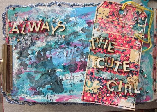
I wanted to do something with the tag, that I showed you yesterday.


So I used my Tiny Attacher from Tim Holtz to attach the tag on a mop up page in my Art Journal.  

Some girls, or women,  are never the beautiful kind. That's just how it is. I have always been the cute girl, but I'm fine with that. :)


From the beginning this is a mop up page, where I've added acrylic paint partly mixed with gesso. Love that effect! :) Then I "stamped" with a mask and the left over mist that was on it.

The mist was Black Marble from Dylusions, and it gave a mystical feeling.

After I adhered the tag I added the word "always" and some bling on the page to match it with the tag. 

onsdag 9 oktober 2013

The cute girl

This spring Swescrap was sponsored by En Liten Butik, and I was one of the lucky ones to get a kit from them. :)


One of the things that I created was this tag, and I got to play with a new (for me) product...


... Stampendous Color Fragments. I had never seen it before... it looke mostly like fish food to me... but I went on youtube looking for inspiration...


... and I saw someone adhere it to paper with clear embossing powder. I needed to try that! :)

So I gathered my Perfect Medium from Ranger, some clear embossing powder, a pink embossing powder, a Prima washi tape stamp, a manilla tag and the Fragments. 


First I embossed the stamp with the pink embossing powder. Cool, right? :)

Then I added the Fragments and clear embossing powder over the entire tag. Like it! :)


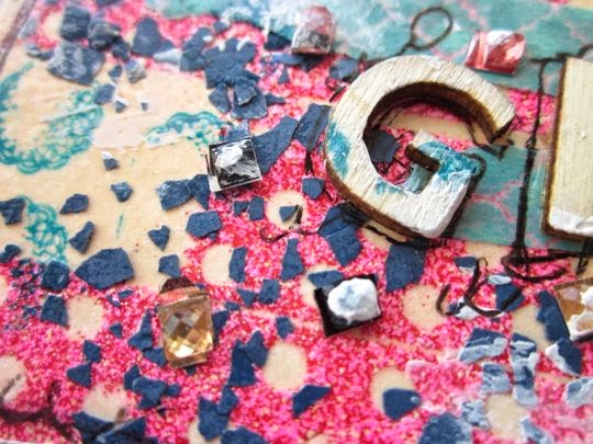
A close up of all the yumminess on my tag. :)

To finish the tag I added bling, washi tape, wooden letters, a roller stamp and some gesso. Thanks for the kit! :)

måndag 7 oktober 2013

The Flowers

Even though I'm out of the European Scrap Battle, I made a layout based on the challenge for Battle #4. I was so inspired by it, and immediately got this idea. :)


This is a lovely photo of my nephews cousin in the US. He is sooo cute. :)

The challenge was "Flower Power" - use as many flowers as possible. I don't normally use that many flowers on my layouts, but this felt like the perfect opportunity to use up a lot of all the flowers that I carry in my scrap stash. In the beginning of my scrap career I bought a lot of these flowers... and now I got to use them. :)


I draw some circles on the wooden wall paper, using different circular items as molds. Then I cut them out and drew them on the cardstock that I would use underneath. And started gluing flowers down.... took a while... :)

I should have counted them, before gluing them on. It would have been fun to know, but... at least I know that here are a lot  of them! :)


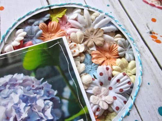
This is how it turned out. I had in mind to use a calm patterned paper on top, that I cut out circles from... letting the flowers pour out through the holes. And then I found this wooden wall paper.

I saw last weekend, at Stockholm City Scrap, that there were a lot of pattered paper manufacturers that had started with papers with die cut holes in them. But I got this idea before seeing that, and apparently great minds think alike. :) 


I was really pleased when I found this wooden wall paper in my stash, cause it feels like the flowers are pouring out from a garden behind the wall.

To make it more me, I splattered with Dylusions mists in Calypso Teal and Squeezed Orange over the wood wall.


I also did some embroidery around the edges of the circles. It took some time, but I like the outcome and the calmness of just sitting there letting the needle do the work.

When I already held the needle in my hand I also used it to scratch around the edge of photo.


One of the rules was to use three different paper flowers. Even though these are all from PRIMA, there are a lot of different ones. 


The second rule was to have a flower patterned paper on my project. Here you can see the small strip that I used, and the flowers outlined in white on it.


A last photo of the 3D effect - Flowers pouring out = Love! :)

söndag 6 oktober 2013

What does the fox say?

This is one of the questions I often ask myself... or maybe not...


... but anyway, you start to wonder. Hmmm? :)

lördag 5 oktober 2013

A colorful life - The European Scrap Battle #3

This is my contribution to The European Scrap Battle #3. The challenge was to use a lot of colors, and not to use any black or white. This was a really hard challenge, cause normally I use black and white to make other colors pop. But I found my way around it. :)


This is how my contribution turned out. :) I like it, even though I know that I need to practice harder. :)
I have registered to three different online workshops where I will learn to draw faces. I really would like to drawn more faces, but I know that it takes a lot of practice.


I cheated a bit when I made this face... :) One of the workshops that I will take is FACEinating girls. And in that workshop you use stamps as guidance. First I stamped with a light yellow, and then I filled it in with a brown pen and gave her hair. I love that I gave her pink hair! :)

I started painting the girl on a piece of flesh colored cardstock (thinking I would cut it out and glue it into my Art Journal). But her hair got to big so I kept her on the cardstock.


It was slightly hard making the shadows, but I'll learn... 
I used Golden fluid acrylics. Love the quality and shine they have. And I used light pink, acrylic paint from Deco Art, as a substitute to white.


For the background I used golden fluid acrylics - green gold. At the bottom of the photo, you can still see the cardstock.

After coloring it green I used Liquitex glass beads gel through a D.Downey mask. That is a real fun medium, that dries clear. :) Then I smeared some Lummire metallic acrylic paint - Pearlescent Blue over a Dylusions mask, did some doodling with a brown pen (instead of a black), and stamped with two roller stamp i teal and vintage photo.


When I wrote the text I was inspirered by Christy Tomlinssons She Art creations, where the text is written in past tence.

Here you can see that I used the gelatos polka dot tool and fluorescent pink on the background as well.


A close up of the eye, to show that I worked without black and white, that was one of the rules of challenge. I worked with a dark teal pen, and did the eye whites with the light pink paint. The highlights are done with the back of a brush and yellow acrylic paint.

tisdag 1 oktober 2013

Moster - The European Scrap Battle #3

This is my contribution to the European Scrap Battle #3:


The photo is from last summer, I think, on me and my niece and nephew. We are at our favorite beach up in the middle of Sweden. :) The title says "Moster", which means Aunt in Swedish... and it also says "Today, Tomorrow and Forever". I love being their aunt! :)

Since the challenge was to use a lot of colors, I used a patterned paper from Sasssfras Lass. I just love their papers, and am sad that they stop making them. :/


First I misted with a Dylusions mist in orange over a mask from Prima. I think it's pretty cool that it shows through the modeling paste - the oval shape. Can you see it?

Then I colored modeling paste, from Liquitex, with red acrylic ink. I didn't use very much of the ink, since I wanted to keep it light. I smeared it across the page, where I knew I wanted the photo, with a spatula. I didn't want it smooth, so I scratched in it and used a roller stamp. When that was dry I added some dots with a Gelatos polka dot tool and yellow acrylic paint. I also added Lumiere acrylic paint - Pearlescent Blue over a harlequin mask from Dylusions and stamped with the same paint in the color Pewter with an empty toilet paper roll. Fun fun fun! :)


A closer shot, where you can see the texture in the modeling paste. Love it! :)

To grunge it up a bit more, I stamped with some word stamps from Christy Tomlinson in red and teal and splashed with Bubblegum pink Dylusions mist.


I love to add a lot of embellishments, in clusters. Some one might think it is to much, but I love it. :)


Layers created depth in the layout, that I love the look of. Here you can see all the layers - paper, modeling paste, stamps, more paper, enamel dots, thread, cross stitches, a felt owl, more pattern paper, the photo and wood embellishment. :)


A close up of all the mediums - Dylusions mist, colored modeling paste, yellow acrylic dots, pearlescent blue harlequin pattern, pewter circles and splashes of mist. Gorgeous! :)

In the middle of the photo the plus signs from the roller stamps is visible. Texture is the thing! :)


As I mentioned earlier in the post, the challenge was to use a lot of colors... and the rule was also not to use any black or white. A difficult rule, that I had to work hard to follow. Try it yourself and see how hard it is. :)

This is a photo that I took to show "the judge" Fia, that the pattern paper isn't white even if it looks like that on the layout photo.


The title is in green felt thickers, that I outlined with a green pen. The enamel dots are so yummy! :) Looks like candy.

I'm sorry that I didn't make it through to Battle #4... :( ... but I might take on the challenge any way...